Ugh, I'm sick of working on the invites! Input needed on design/style/wording....EVERYTHING! I've spent the last 1.5 days working on it and don't want to move much further until I get some input. I will be printing it in gold metallic ink on wine red paper (the lotus flower on the bottom I plan to have in a metallic lavender) on Gocco printer.

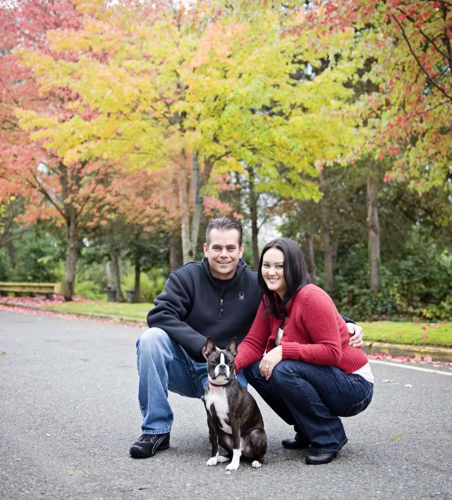
Family fall photo session with Ashley Hoyle Photography
Married 7/10/10
Wedding Planning Bio - Updated 6/13/2010
